WORK
Increase speed to market
Are you 100% satisfied with how quickly and how accurately your teams define and build products? Would your teams say they have all the tools and systems available to do their best work? This is a continuous improvement challenge for most organizations and a critical role for leaders.
I love finding lean, cost-effective ways to improve the accuracy and efficiency of product development. Better insight, better collaboration, better front-end development. I'm a strong believer that culture eats both strategy AND process for breakfast, but I also believe the right product development habits can be encouraged with well designed meetings, templates and tools.
Example 1: Research OPS AT ATHENAHEALTH
Overnight customer insight.
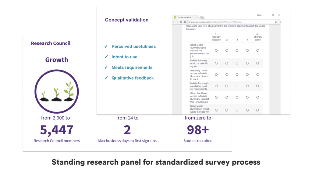
athenahealth had more than 50 customer-facing scrum teams building and iterating features. Every one of them needed user feedback to steer their designs and typical research approaches were not scaling.
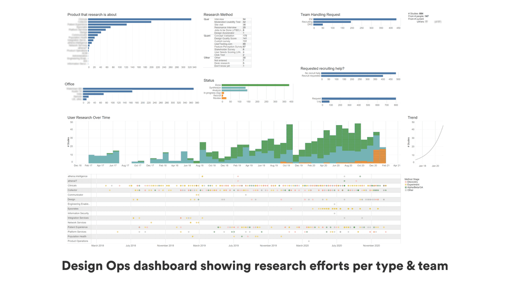
In partnership with my UX research leader we built out a world-leading ResearchOps function that gave teams instant access to relevant users, standardized test formats and research dashboards.
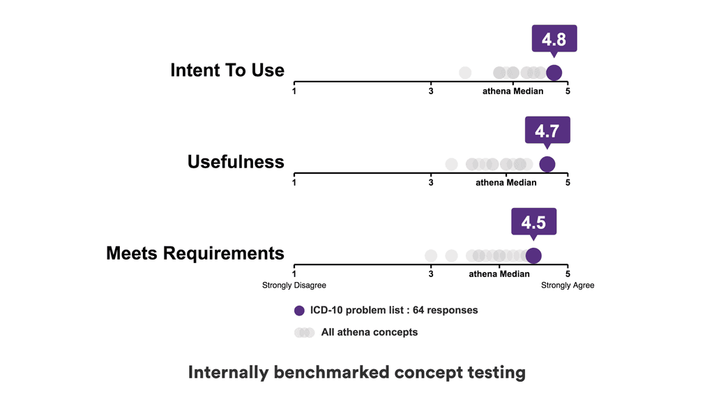
The scrum teams loved it - running more than 30 concept tests per month - and the users loved it too. The test results and the management dashboards also fostered great conversation with cross-functional leaders about where we were investing, which teams were stuck, and how to move forward.
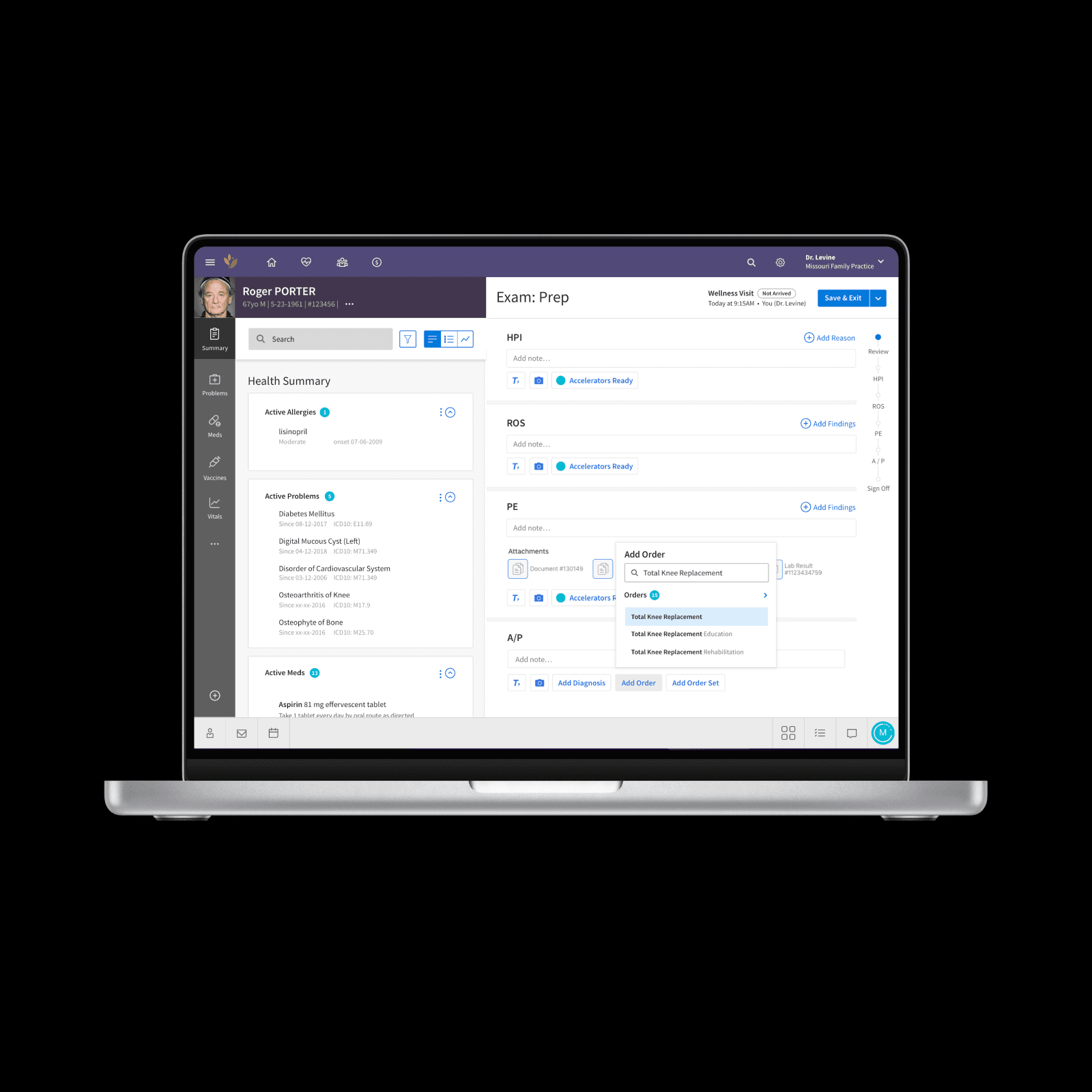
Example 2: Forge DESIGN SYSTEM AT ATHENAHEALTH
Quicker, better front-end development.
athenahealth had a design system - custom built in PERL and outdated both in terms of code and styling. It had served the company well for 3 years but was now holding everyone back. The new CTO agreed that we needed to make an investment, but he was insistent that Polymer was the correct choice.
With my advocacy, the design team led an effort to assess the various options in terms of technical strengths, external zeitgeist (important for recruiting and training) and internal preferences. Ultimately the company selected React and while not everybody agreed - the process we'd been through meant everybody could commit.
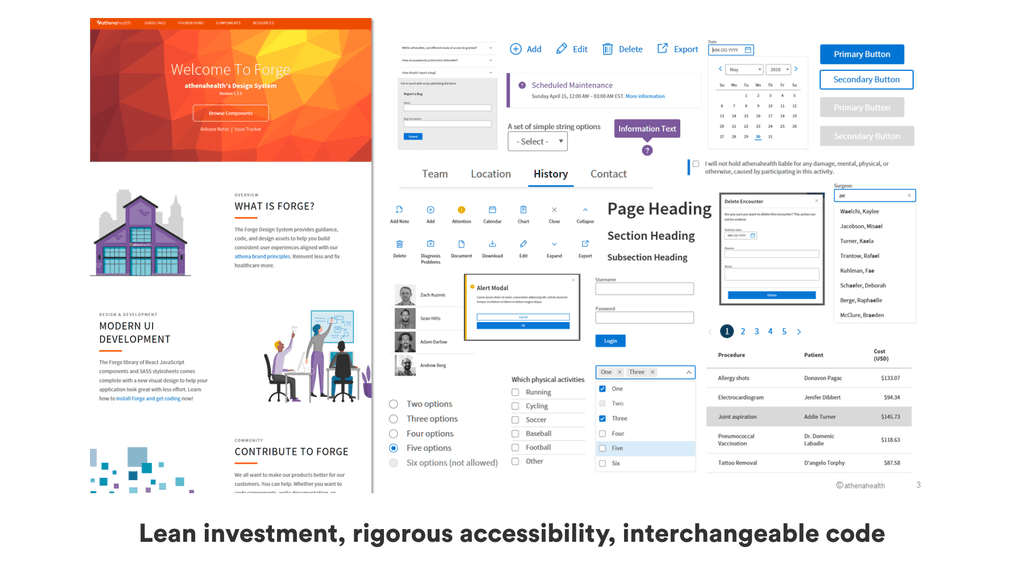
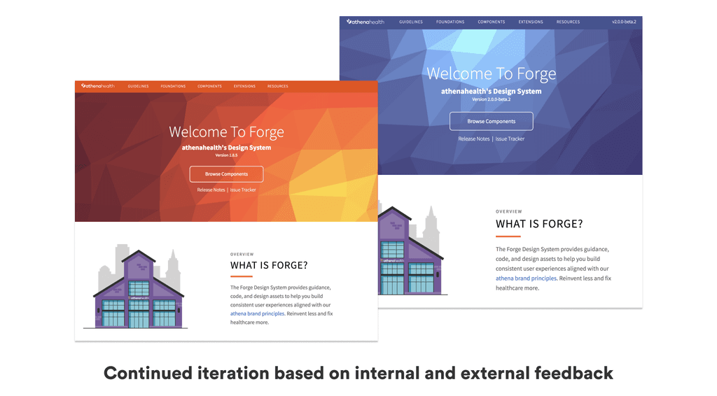
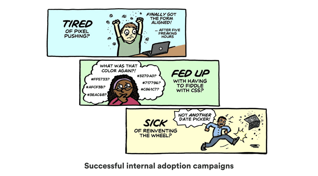
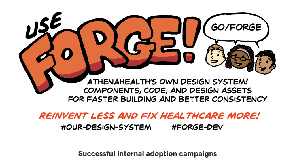
We continued to house the Forge design system effort - stealing ruthlessly from external resources to move quickly, designing every component to meet the stringent requirements of a critical healthcare tool, and constantly engaging with the 1200+ designers and developers internally.
The struggle was real, but Forge was a success. Version 1 saw rapid uptake, and after some important tweaks, Version 2 was universally accepted. Analysis during and after launch showed 5x faster development, and usability scores improved as well. Practically all new functionality at athenahealth is now built using Forge or, in the case of new patient-facing apps, the consumer-centric branch of the design system named Spark that Forge inspired and enabled.
